Looking sharp - 10 years of CPU Recordings
Wednesday, August 24, 2022
by Tat
Whether you are a vinyl, CD or digital digger there are labels that just leap out at you like an old friend in a crowd, an instant recognition and pleasure response. We all have our favourites, the ones that simply tell us by their looks alone that this label delivers.
Iconic labels, their logos and colour schemes last in memory, especially for those who respond to images over text. If I say purple sleeve then you might think of Warp Records, brick wall conjures up Strictly Rhythm, silver and blue combo with a horse shouts Belgium's R&S imprint. Whereas there are the labels that take art to another level by collaborating with actual graphic artists to create stunning sleeves that are a million miles from the hand stamped white labels that remain popular but create headaches for record collectors rifling through their shelves. Paul Murphy’s Claremont 56 and Steven Rutter’s Firescope Records are fine examples of a truly polished artefact.
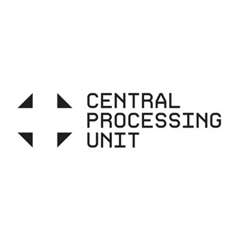
Back to the iconic labels that put the time and effort to create a visual hook and stick with it, Central Processing Unit is a fine example of a label today that you’ll recognise in years to come. Reminiscent of Jeff Mills legendary Axis label, CPU takes monochrome colours, a striking white background with four black triangles in each corner which throws in binary code as the catalogue into the mix. These two things along with an ice white sleeve mean that if you are a fan then you will recognise it instantly, if you have never heard of CPU then you’re equally going to want to check it out. It is mysterious, alluring and the music top quality. Whilst each release might look identical, there is enough information to let you know what exactly you are looking at.
With a decade of putting out great music and over 100 releases, there will be proud CPU fans across the globe with a segment of their racks notably white in colour. The effort to style such an iconic look also has meant it has been easier for the label to create other merchandise, especially clothing and even an actual filter for a recording studio that all again features that logo. Sometimes there is a small curveball with such as a sentimental nod to Warp’s iconic purple sleeve and the 50th release with a rebuild of two Sheffield classics by Detromental. A double vinyl remix LP was pressed with a reversed white on black sleeve, and more recently John Shima’s CPU Modular 1 EP had a cool inner sleeve with the kit used to make the record, again with a cool white background. Yet despite these occasional forays, Smith does not deviate far from the vision he set out with ten years ago, and it has paid off.
The label has gone from strength to strength, releases sell out on Bandcamp, they go for good money second hand on Discogs and artists new and old have helped build one heck of a back catalogue. We wanted to explore the label a bit more so spoke to label boss Smith, internationally renowned designer Nick Bax from Human Studios and Dallas based, CPU recording artist Phillip Washington AKA Cygnus about what it is that makes CPU stand out so brightly.

When you came up with the concept of the label, how central to that was the visual aspect?
(Smith) The visual aspect was key. I wanted it to set an electronic tone and give a lasting first impression.
What was the inspiration for the label’s clean visual look?
(Smith) It was born out of the name Central Processing Unit. CPU was taken from a much larger list of potential label names all in the computer, science and technology realm. I guess CPU allowed Human Studio to freely experiment with the aesthetics of computing.
How aware of Chris Smith AKA Sheffield Bleep were you when he approached you with his idea of CPU Recordings?

(Bax) I’d seen Sheffield Bleep mentioned online and on various flyers, although I’d never met Chris or seen him playing at that point. We also had some very good mutual friends that knew we would get on and brought us together.
For music collectors wading through thousands of new releases each week it can all be a bit too much, but that iconic CPU logo certainly stands out. As an artist and music collector, it must really help to have such a striking imprint tied to your music?

(Washington) The procession of binary numbers for the catalog numbers, and the identical logo/print otherwise for each record establishes a baseline; the art is the spike emerging from that baseline scan. The logo instils a feeling of trust and familiarity; that your expectations won't be completely subverted and you can rest easy knowing you bought the record. That's a really cool thing. Kind of like how you had MacFarlane comics, DC or Marvel. I do believe this has a considerable merit behind it. There's much to say about freedom of infinite expression with regard to album artwork. There's also a lot to say about unified design concepts that establish a sense of cohesion and gathering. After all, the binary codes which mark each CPU release could be represented as physical addresses on a database, constituting a map or an interconnected matrix of quasi-independent, converging systems. Computers are agnostic and unaware of what we do with them (for now), but the varied expressions and experiences they make possible are infinite. The cold, distant, black & white code gives way to the warmth of our electro.
In this modern, discombobulated world, there's much to say for cohesion and unification. I think Chris has the right idea with CPU's aesthetic and I have an enormous amount of respect for him for keeping it that way.
You clearly had a vision and have stuck to your guns whilst single handedly running the operation. Were there ever times when you’ve felt conflicted by listening to external commentators who tried to change the direction of CPU Recordings?
(Smith) Some people don’t get it, including some of the artists which I have had to convince. It’s natural to want your own cover or something different. But CPU is all about that consistent look which I think helps encourage collectability and sets the scene for the style of music contained within. Labels like Strictly Rhythm and Nervous had a consistent look throughout their catalogue. And Warp, in the early days with their purple covers, which was my main influence. I used to buy those purple covers without listening as I knew they would be great. That is exactly what I wanted for CPU.
You seem to have a wide ranging passion for technology from computers to science fiction, where music helps translate that world view. Is that a fair assessment?
(Smith) Yes, I am a geek. I love science fiction. I like to build computers and I am an avid gamer. CPU is hopefully the soundtrack to like minded people.
As a recording artist how important do you think the aesthetics are with regards to physical and to a wider extent, digital releases?
(Washington) Aesthetics are important, of course, for similar reasons as a name is important to a person or a pet, a company or an idea. Aesthetics serve as a kind of outer-layer or "veil" of something contained within. My real name is Phillip (an aesthetic demarcation, like a bridge) but cohesively I am much more than that. And an album is the same. The art on an album points towards the ideas contained within, like a name does. Serves as a kind of visual identification. This is important because we have a need to identify and relate to things. Aesthetics can help that process. Aesthetics are a bridge.
To some extent CPU feels like Warp Records 2.0, visually and musically, Chris must have known you were the right person to help launch this endeavour given your work with The Designers Republic? Can you remember the concept he pitched?
(Bax) I’m a huge fan of Warp Records output, particularly from the early days and in the 90s, so it was a thrill for me to actually work on some of the covers around that time. We both loved the original purple Warp covers – you saw that colour and knew it was a Warp release. Chris said he would love something as iconic as those purple sleeves.
You’ve released a few records with CPU now, how would you best describe CP Smith’s label outside of the actual music?
(Washington) Outside of the music, CPU as a label has established itself as a very (allow me to invent a word) "Computerrific" enterprise. The aesthetic is fully black & white, with words, numbers and the geometric symbol everyone is very familiar with. It's easily recognizable as a brand. I look at it as a kind of series of issues, like a magazine publication or comic series. But the procession of issues is binary, like the processes in a computer. This is very kraftwerk-esque, and follows that way of seeing things. Much like a publication, the label itself seems to be agnostic concerning its own contents. It is bereft of politics, religious concepts, intellectual pursuits - it is just about music. It is just reporting, or processing what is relevant to electro and dance music.
Your reputation and portfolio is without question world class, but there must be something special when a local artist and label approaches you with a grassroots concept?
(Bax) I was impressed by Chris’s ambition and energy, but equally aware that he’d actually done his research and formed a plan with a sense of realism, which isn’t always the case when people start labels or creative ventures. He made me feel confident that we could actually deliver a vision together!
There was a design logic to those early Warp covers in terms of what I would call “shelf presence”. You would see a wall full of 12” singles in a record shop: HMV, FON, or Black Market Records – maybe with only the top third sticking out – and instantly pick out a Warp release. I suggested a similar concept for CPU, but with the digital environment in mind; when you scroll quickly down a website or through the music on your phone, the white CPU covers stand out in a sea of imagery. There is also the idea of consistency and quality: this is a CPU release, you should buy it.
Do you feel the artwork often gets treated as an afterthought given many music lovers are first attracted to a record by how it looks?
(Washington) The artwork of an album is, of course, extremely important because it serves as an "acoustic mirror", it speaks the same language as the music. It eventually speaks the same language as the person listening to it. We all can completely identify with the cover of Kraftwerk's "The Man Machine", for example. It speaks our inner-acoustic language and has a heartbeat. It's not just an icon. If the artwork is of a place, that's the first place you "go" before you've heard a single note played. It's your first introduction to the ideas contained within the songs. We could also say it's a "hint", or a flirtation. The album cover flirts with the prospective buyer/listener. To that degree, the album cover is a sex organ.
You’ve been an ardent supporter of releasing music on vinyl, which is getting harder these days. Whilst you are a fan of the mini disc, do you see a revival of that format in addition to CDs which appear to be gaining popularity again.
(Smith) I don’t see anything rivalling vinyl at the moment. CDs are great, I love the format but they don’t sell very well and I don’t think young people buy them much at all. Minidisc was my favourite format when it came out until mp3, CDR and the internet killed it. Minidisc today is just a fun format, I don’t think it will come back in any great numbers as you have to source old blank discs if you want to release anything. I believe all commercial Minidisc duplicators have been decommissioned. Cassettes are the cheapest music related physical object an artist or label can produce which is why they keep showing up. But as a format it is dreadful.
Having a shelf full of USB drives doesn’t feel right either. But they are great for one offs or special editions.
Looking back over the past decade is there anything that you might have considered doing differently?
(Smith) I would have spaced releases out more, there was a period a few years ago when I hit two releases a month which was stressful. I gave in to the pressure of sitting on too much great material but I’ve learnt to push back and wait now. There’s no need to rush.
Not many startup small indie labels would have given nearly this much thought as to how a label should look, with your expertise it has clearly paid off?
(Bax The design aesthetic of CPU has helped the label provide a visual platform for some outstanding music. I think Chris deserves credit for sticking to the plan and not being tempted to change the design. Ultimately, he’s realised that the CPU aesthetic is now inseparable from the label and has become a big draw for artists. It’s a sign of recognition and seal of quality to have your music packaged in those zeros and ones!
Using binary as the system for your catalogue numbers means you are capped at 256, what happens after that?
(Smith) Have a break, start again?
What next for CPU?
(Smith) I’ve got some projects and collaborations in the pipeline. A few more releases before the end of the year, then kicking off 2023 with a double vinyl LP from Blackploid.
http://cpurecords.net/
https://shop.cpurecords.net/
Humanstudio.com
https://cygnusat.bandcamp.com/
Discover new digital dance music with Trackhunter